Documentation
Back to TOC
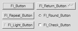
3 - Common Widgets and AttributesThis chapter describes many of the widgets that are provided with FLTK and covers how to query and set the standard attributes. ButtonsFLTK provides many types of buttons:
All of these buttons just need the corresponding <FL/Fl_xyz_Button.H> header file. The constructor takes the bounding box of the button and optionally a label string: Fl_Button *button = new Fl_Button(x, y, width, height, "label"); Fl_Light_Button *lbutton = new Fl_Light_Button(x, y, width, height); Fl_Round_Button *rbutton = new Fl_Round_Button(x, y, width, height, "label"); Each button has an associated type() which allows it to behave as a push button, toggle button, or radio button: button->type(FL_NORMAL_BUTTON); lbutton->type(FL_TOGGLE_BUTTON); rbutton->type(FL_RADIO_BUTTON); For toggle and radio buttons, the value() method returns the current button state (0 = off, 1 = on). The set() and clear() methods can be used on toggle buttons to turn a toggle button on or off, respectively. Radio buttons can be turned on with the setonly() method; this will also turn off other radio buttons in the same group. TextFLTK provides several text widgets for displaying and receiving text:
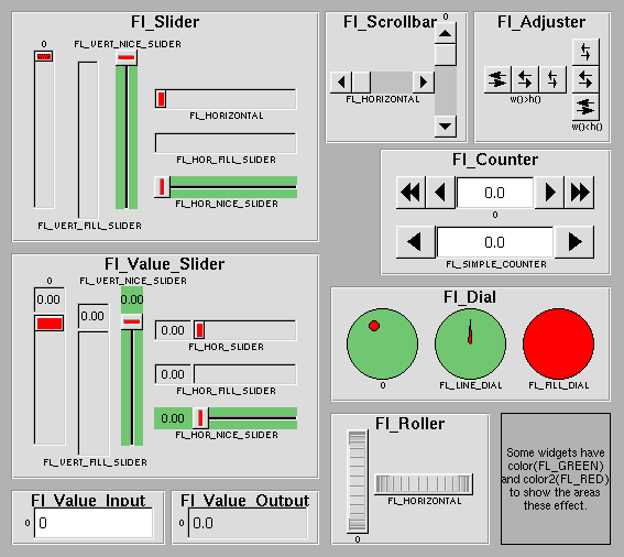
The Fl_Output and Fl_Multiline_Output widgets allow the user to copy text from the output field but not change it. The value() method is used to get or set the string that is displayed:
Fl_Input *input = new Fl_Input(x, y, width, height, "label");
input->value("Now is the time for all good men...");
The string is copied to the widget's own storage when you set the value() of the widget. The Fl_Text_Display and Fl_Text_Editor widgets use an associated Fl_Text_Buffer class for the value, instead of a simple string. ValuatorsUnlike text widgets, valuators keep track of numbers instead of strings. FLTK provides the following valuators:
The value() method gets and sets the current value of the widget. The minimum() and maximum() methods set the range of values that are reported by the widget. GroupsThe Fl_Group widget class is used as a general purpose "container" widget. Besides grouping radio buttons, the groups are used to encapsulate windows, tabs, and scrolled windows. The following group classes are available with FLTK:
Setting the Size and Position of WidgetsThe size and position of widgets is usually set when you create them. You can access them with the x(), y(), w(), and h() methods. You can change the size and position by using the position(), resize(), and size() methods: button->position(x, y); group->resize(x, y, width, height); window->size(width, height); If you change a widget's size or position after it is displayed you will have to call redraw() on the widget's parent. ColorsFLTK stores the colors of widgets as an 32-bit unsigned number that is either an index into a color palette of 256 colors or a 24-bit RGB color. The color palette is not the X or WIN32 colormap, but instead is an internal table with fixed contents. There are symbols for naming some of the more common colors:
These symbols are the default colors for all FLTK widgets. They are explained in more detail in the chapter Enumerations
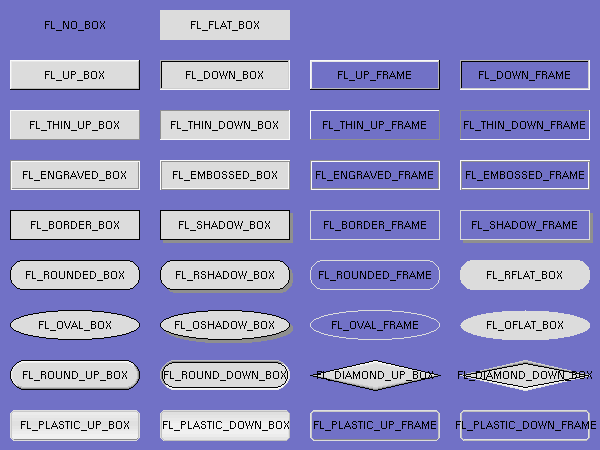
RGB colors can be set using the fl_rgb_color() function: Fl_Color c = fl_rgb_color(85, 170, 255); The widget color is set using the color() method: button->color(FL_RED); Similarly, the label color is set using the labelcolor() method: button->labelcolor(FL_WHITE); Box TypesThe type Fl_Boxtype stored and returned in Fl_Widget::box() is an enumeration defined in <Enumerations.H>. Figure 3-3 shows the standard box types included with FLTK.
FL_NO_BOX means nothing is drawn at all, so whatever is already on the screen remains. The FL_..._FRAME types only draw their edges, leaving the interior unchanged. The blue color in Figure 3-3 is the area that is not drawn by the frame types. Making Your Own BoxtypesYou can define your own boxtypes by making a small function that draws the box and adding it to the table of boxtypes.
The Drawing FunctionThe drawing function is passed the bounding box and background color for the widget:
void xyz_draw(int x, int y, int w, int h, Fl_Color c) {
...
}
A simple drawing function might fill a rectangle with the given color and then draw a black outline:
void xyz_draw(int x, int y, int w, int h, Fl_Color c) {
  fl_color(c);
  fl_rectf(x, y, w, h);
  fl_color(FL_BLACK);
  fl_rect(x, y, w, h);
}
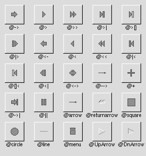
Fl_Boxtype fl_down(Fl_Boxtype)fl_down returns the "pressed" or "down" version of a box. If no "down" version of a given box exists, the behavior of this function is undefined and some random box or frame is returned. See also: fl_frame drawing. Fl_Boxtype fl_frame(Fl_Boxtype)fl_frame returns the unfilled, frame-only version of a box. If no frame version of a given box exists, the behavior of this function is undefined and some random box or frame is returned. See also: fl_frame drawing. Fl_Boxtype fl_box(Fl_Boxtype)fl_box returns the filled version of a frame. If no filled version of a given frame exists, the behavior of this function is undefined and some random box or frame is returned. See also: fl_frame. Adding Your Box TypeThe Fl::set_boxtype() method adds or replaces the specified box type: #define XYZ_BOX FL_FREE_BOXTYPE Fl::set_boxtype(XYZ_BOX, xyz_draw, 1, 1, 2, 2); The last 4 arguments to Fl::set_boxtype() are the offsets for the x, y, width, and height values that should be subtracted when drawing the label inside the box. A complete box design contains four box types in this order: a filled, neutral box (UP_BOX), a filled, depressed box (DOWN_BOX), and the same as outlines only (UP_FRAME and DOWN_FRAME). The function fl_down(Fl_Boxtype) expects the neutral design on a boxtype with a numerical value evenly divideable by two. fl_frame(Fl_Boxtype) expects the UP_BOX design at a value divideable by four. Labels and Label TypesThe label(), align(), labelfont(), labelsize(), labeltype(), image(), and deimage() methods control the labeling of widgets. label()The label() method sets the string that is displayed for the label. Symbols can be included with the label string by escaping them using the "@" symbol - "@@" displays a single at sign. Figure 3-4 shows the available symbols.
The @ sign may also be followed by the following optional "formatting" characters, in this order:
Thus, to show a very large arrow pointing downward you would use the label string "@+92->". align()The align() method positions the label. The following constants are defined and may be OR'd together as needed:
labeltype()The labeltype() method sets the type of the label. The following standard label types are included:
image() and deimage()The image() and deimage() methods set an image that will be displayed with the widget. The deimage() method sets the image that is shown when the widget is inactive, while the image() method sets the image that is shown when the widget is active. To make an image you use a subclass of Fl_Image. Making Your Own Label TypesLabel types are actually indexes into a table of functions that draw them. The primary purpose of this is to use this to draw the labels in ways inaccessible through the fl_font mechanisim (e.g. FL_ENGRAVED_LABEL) or with program-generated letters or symbology.
Label Type FunctionsTo setup your own label type you will need to write two functions: one to draw and one to measure the label. The draw function is called with a pointer to a Fl_Label structure containing the label information, the bounding box for the label, and the label alignment:
void xyz_draw(const Fl_Label *label, int x, int y, int w, int h, Fl_Align align) {
...
}
The label should be drawn inside this bounding box, even if FL_ALIGN_INSIDE is not enabled. The function is not called if the label value is NULL. The measure function is called with a pointer to a Fl_Label structure and references to the width and height:
void xyz_measure(const Fl_Label *label, int &w, int &h) {
...
}
The function should measure the size of the label and set w and h to the size it will occupy. Adding Your Label TypeThe Fl::set_labeltype method creates a label type using your draw and measure functions: #define XYZ_LABEL FL_FREE_LABELTYPE Fl::set_labeltype(XYZ_LABEL, xyz_draw, xyz_measure); The label type number n can be any integer value starting at the constant FL_FREE_LABELTYPE. Once you have added the label type you can use the labeltype() method to select your label type. The Fl::set_labeltype method can also be used to overload an existing label type such as FL_NORMAL_LABEL. Making your own symbolsIt is also possible to define your own drawings and add them to the symbol list, so they can be rendered as part of any label. To create a new symbol, you implement a drawing function void drawit(Fl_Color c) which typically uses the complex drawing functions to generate a vector shape inside a two-by-two units sized box around the origin. This function is then linked into the symbols table using fl_add_symbol: int fl_add_symbol(const char *name, void (*drawit)(Fl_Color), int scalable) name is the name of the symbol without the "@"; scalable must be set to 1 if the symbol is generated using scalable vector drawing functions. int fl_draw_symbol(const char *name,int x,int y,int w,int h,Fl_Color col) This function draw a named symbol fitting the given rectangle. CallbacksCallbacks are functions that are called when the value of a widget changes. A callback function is sent a Fl_Widget pointer of the widget that changed and a pointer to data that you provide:
void xyz_callback(Fl_Widget *w, void *data) {
...
}
The callback() method sets the callback function for a widget. You can optionally pass a pointer to some data needed for the callback: int xyz_data; button->callback(xyz_callback, &xyz_data); Normally callbacks are performed only when the value of the widget changes. You can change this using the when() method: button->when(FL_WHEN_NEVER); button->when(FL_WHEN_CHANGED); button->when(FL_WHEN_RELEASE); button->when(FL_WHEN_RELEASE_ALWAYS); button->when(FL_WHEN_ENTER_KEY); button->when(FL_WHEN_ENTER_KEY_ALWAYS); button->when(FL_WHEN_CHANGED | FL_WHEN_NOT_CHANGED);
ShortcutsShortcuts are key sequences that activate widgets such as buttons or menu items. The shortcut() method sets the shortcut for a widget: button->shortcut(FL_Enter); button->shortcut(FL_SHIFT + 'b'); button->shortcut(FL_CTRL + 'b'); button->shortcut(FL_ALT + 'b'); button->shortcut(FL_CTRL + FL_ALT + 'b'); button->shortcut(0); // no shortcut The shortcut value is the key event value - the ASCII value or one of the special keys like FL_Enter - combined with any modifiers like Shift, Alt, and Control. User Comments [ Add Comment ]From greg.ercolano, 13:13 Nov 26, 2007 (score=3)I believe the example in the gray box under the 'Callbacks' section is wrong in many ways for 1.1.x documentation. As of this date, the example currently reads:
class foo {
  void my_callback(Widget *);
  static void my_static_callback(Widget *w, foo *f) { f->my_callback(w); }
  ...
}
...
w->callback(my_static_callback, this);
The problems being 'Widget' instead of 'Fl_Widget', 'foo' instead of 'Foo', and the userdata for the callbacks being non-void. That example should probably read more like this (changes in bold):
class Foo {
  void my_callback(Fl_Widget *);
  static void my_static_callback(Fl_Widget *w, void *userdata) {
     Foo *f = (Foo*)userdata;
     f->my_callback(w);
  }
  ...
}
...
w->callback(my_static_callback, (void*)this);
I believe these fixes have been made in SVN for 1.1.x, but the current online docs still show the bad example. This comment will probably be stale once the SVN version of the docs are updated to the website. Until then, hopefully the above suffices. [ Reply ] From Albert ARIBAUD, 00:39 Oct 13, 2003 (score=1)In the label() method paragraph, the symbol names UpArrow and DnArrow are quite misleading. These usually denote cardinal directions along the screen plane. RaisedArrow and LoweredArrow would be a better choice IMO. [ Reply ] From Matthias (fltk, 18:07 Apr 24, 2002 (score=1)To image() and deimage() should be explicitly noted, that the image will be part of the label, not of the content of the widget. All align() calls and flags also apply to the image! So usually, the image will NOT by default be centered . [ Reply ] |
Comments are owned by the poster. All other content is copyright 1998-2008 by Bill Spitzak and others. This project is hosted by Easy Software Products. Please report site problems to 'webmaster@easysw.com'.


